Comment

7 steps Branding Guide for startups

cover-61.jpg

I’ve seen too many people just want a LOGO when they create a brand. After talking to them 10 minutes, they realized branding is way bigger than than think. They didn’t expect it’s a whole system than just drawing a symbol. So what is branding?

A branding is a person’s gut feeling about a product, service or company.

-Marty Neumeier, the author of The Brand Gap, ZAG


Branding is not marketing. They are closely intertwined. Marketing is how you connecting to your clients; branding is telling them why we do what we do. I’ll later add an easy marketing guide for startups.

Nailing down your branding is tremendously important for your company at the beginning. It is your marketing positioning, the direction for your design, the way you build your tribe. In today’s extremely cluttered marketplace, getting people’s attention has become more and more difficult. It requires lots of experience to do the branding right. But don’t worry! Let’s get you some basic to start!

Branding 101 - Free branding guide for outdoor/ sustainable brands. Cerra Teng Design

7 steps to define your brand

  1. What makes you unique in this market?

  2. Do research on your users and market

  3. Know your target audience

  4. Create a mood board

  5. Define the brand voice

  6. Design a logo

  7. Create a style guide

FREE PDF DOWNLOAD HERE!

This guide is particularly created for outdoor or sustainable brands but it can be also used in other industries. The goal is helping you to have the basic understanding and be able to communicate with your designers.

FREE pdf download HERE!

Comment

If you don't want to be the best, don't even bother

1 Comment

If you don't want to be the best, don't even bother

In the book “The Dip” by Seth Godin, he mentioned that for everyone wants to excel something, he/she will experience “the dip”. Think of the days when you just started to learn climbing - everything is so fun and you can feel your progress everyday. From struggling 5.9 in the gym to be able to send 5.11-; from top-rope 5.7 outdoor to lead 5.10s,… until you start to project 5.12s.

DSC_0827_edit.jpg

It takes more and more tries to redpoint; you need to do hangboarding to make your finger stronger; maybe lose some weight? or do some core workout? You even feel your progress become negative. It’s frustrating and not fun anymore… That’s the dip.

Most people quit at the dip. That’s why there are not many climbers go beyond 5.12s.

Apply to the business - most companies are struggling; most startups failed; only very few made it to the top.

Why? Can I be the second, or somewhere in the middle?

2020_portfolio-60.jpg

The problem is the first few best companies have the majority of the market share. People like “THE BEST”. The best of their own world. People know Daniel Woods, Alex Puccio as the strongest boulderers, Hazel Findlay as the best trad female climbers, Pamela Shanti Pack as the off-width expert. People care about the first accent, not the second accent. (Unless it’s the hardest route in that category.)

If you foresee the effort will be too big that you can’t afford, quit before you even start. If you’re already in the dip, it’s the worst time to quit.

If you’re experiencing the dip, you know it’s hard and frustrating. As a climber, I’ve experienced the dip in the past couple months as my fingers have been injured. Still trying to keep training and doing isometric workout. My business is experiencing a dip due to COVID-19 quarantine. There’s a lot uncertainty in the future. If you’re experiencing the same thing, you’re not the only one.

1 Comment

[Rebrand] Mt. Bachelor ski resort - research phase

1 Comment

[Rebrand] Mt. Bachelor ski resort - research phase

COVER-02.jpg

I wanted to do this personal project to show my design process. Of course every company is different and the process will be adapted accordingly. The project is separated into 4 different sessions:

  1. Research

  2. Design Brief

  3. Logo Ideation

  4. Style Guide and Application

As I just started this project, I didn’t expect COVID-19 will cause the world-wide shut down and all the ski resorts closed earlier than they planned. Since I’ve been quarantined at home, I couldn’t get all the interview done. Ideally I would like to get more data from different demography and get the ski resort involved.

Brief intro

Mt. Bachelor is a volcano located in Central Oregon. The ski resort is one of the biggest ski resort in the US (#6 in terms of the area.) It’s a volcano so you actually can ski 360°.

19-20_WinterTrailMap_Final.jpg

It’s owned by Powdr Corp which is also the company that owns Woodward. If you are not familiar with Woodward, it’s an action sports company. That’s also the reason why Bachelor terrain park got branded as Woodward in 19/20 season.
It also offers nordic skiing and tubing in winter; mountain biking in summer.

competitors

There are two types of competition for Bachelor - nation-wide and local.
For nation-wide competitors, I would point out the humongous corporates in ski industry - Vail and Alterra. Vail owns Epic pass, and Alterra owns Ikon pass. They both include crazy amount of ski resorts in the US and international destinations. If you’re a skier/snowboarder, you know the ski resorts included in these two passes got hammered by tourists.

competitors-02.jpg

Since Mt. Bachelor is not part of Epic or Ikon pass, most of the visitors are local or PNW dwellers. The competitors are the mountain resorts that’s located in the vicinity.

map-01.jpg

audience

Currently customer profile is local people living in Central Oregon (Bend, Sun River, Eugene) and weekenders from Portland. Local people usually buys season pass; city weekenders usually get 4-day pass. I roughly outline the four main types of audience-

web-02.jpg

Here’s the more detailed version (they’re based on my observation):

Fun Chaser
Skiing/snowboarding is their life. Most of them work at ski resort or have a part-time job at night that doesn’t affect their ski schedule. The style! It’s all about the style! They usually stay in park where they find most of the fun is - but if they go out, they make other people look like beginners.

Mountain Goat
They live in Bend or Sunriver and likely are weekday or senior pass holders. On powder days they would go on the mountain get some fresh turns in the morning and get back to work later. They’re decent in what they’re doing and not afraid to shred on the gnarly terrain.

Summit Achiever
It’s not surprising to see a Gopro on their helmets. They usually have experience traveling to different ski resorts across North America. If the summit lift is open, they’ll be in the line. This type of user has higher chance morphing to backcountry skiers and ditch ski resort.

Groomer Taker
They usually come with family and are the main contributors to the lodge. They would come early on a weekend, spend whole day at ski resort, and take a lot of photos. Restricted by the days they can come out skiing, they might have skied for many years but still stick with groomers. They probably have a Summit Achiever Dad.

user research - interview

The goal of the interview is understanding who they are and their experience at Mt. Bachelor. Ideally (without being quarantined), the interview will be targeting 4 different users:

  • Park rider, very experienced

  • Mountain cruiser, intermediate level, local

  • Around 40 yo have 2-3 kids

  • Expert knowledge in Bachelor 

I did manage to do two interview before the COVID-19 outbreak.

interview-03.jpg
interview-05.jpg

I don’t do survey or traditional interview. People usually give the answers you want, or they think who they are. Here’s the diagram showing different approach that can reach to different levels of human psychology.

web-08.jpg

I listed the questions I would like to know from the users, and designed the practice with different research tools.

web-07.jpg

The process is almost like a therapy. Interviewer has to carefully listen to what user say and ask questions to dig deepr.

Along with the marketing research, the design team will filter the data and generate insights. The next step will be creating design brief, 6 attributes, and mood board.

1 Comment

Comment

How can a company respond to COVID-19?

2020_portfolio-59.jpg

We don’t know how long the quarantine is gonna last but we do know most of the business got affected. People are losing their jobs as things are shutting down. Even if the current situation magically improves in a month and everyone is free to walk outside again, the economy is not gonna bounce back immediately. People will change their behavior in purchasing, working, social, etc. Regardless what’s the government policy for the next step, let’s just admit:

It sucks.

But let’s not bitch about it. Nor criticize the people who just went outside of their houses. You can embrace the changes.

Remote work actually works

I’ve been working at home for a long time, and I love it. I never like to work in the office and being interrupted or listening to coworkers chit-chatting for an hour straight. I have the idea that the less time you’re sitting in front of your laptop working, the more free time you have for yourself. I also love how much less traffic it is in the city (at this moment I’m in Salt Lake City). The air quality has been hugely improved. (This is the real news in China.) For a company, you need less or no working space. For individual, you spend your time wisely and locate those free time to do something you love.

Online service

I’m kinda bummed that I didn’t buy Zoom stock before all of this happened. Online communication is way more demanding than it has ever been. I don’t think online communication will totally replace face-to-face after things get settled. But some people are realizing lots of things can be done by sitting at home. Again, saving the traffic time. That’s being said, offering online service (with the huge discount offering now) is the way to go. Adobe already offered two free months for all Creative Clouds products. If you need to take the damage better take the future potential customers with you.

Door to door service

When Park City announced to shut down for 30 days, some restaurants started to offer deliver-to-door service. It’s a great idea for a business to minimize the impact. They still can operate, and pay their employees. So people still can pay their ridiculous rent in Park City. Lots of my friends are saying they don’t know what to eat now (since they usually don’t cook). That’s an opportunity to fulfill their needs.

Invest in Research

For companies that are selling physical products, I suggest to rethink about your brand positioning and review all the product lines. Drop the ones that don’t align with your brand. Only keep the core ones, and create the new products based on the new findings at this time. Streamline your products. Keep it lean. Make something that will really resonate in your tribe.

support your tribe

At this time, people appreciate any small helps. Depending on where you are at financially, supporting the community is a great way to create the bond. For example, some restaurants in Bend offer free meal for those who got laid off because of COVID-19 quarantine. Not saying doing this merely for the purpose of promoting brands. Your audience has been supporting you along the way. Giving a hang and showing gratitude will make this people think this brand is own by human.

enjoy it now, pay it later

If you know your product is more like a luxury product for users (something it’s nice to have a new one but it’s not necessary; it’s also more expensive), it’s nice to offer installment plan. People during this time is less willing to spend their spending on something that is not essential. Give them a chance to get something that will make them happy while not burdening their current financial situation.

do good

Similar to support your tribe, but extend to people that are not your users/ audience. For example, donate food to low-income families; provide products to those who need; give a certain percentage of profit to the organization that’s fighting COVID-19. It’s time to help each other to get through this difficult time together.

Every company’s product or service is different. You might find some useful and some not applicable. If you want to talk more, feel free to contact me: cerrateng@gmail.com

Comment

Delighted, by a coconut

Comment

Delighted, by a coconut

My husband and I went to a Thai restaurant after climbing few days ago. We haven’t gone out eating for a while since we both are decent at cooking. Honestly I’ve been just disappointed about the food here. It’s usually overpriced, and the quality is meh.

This place is quite nice and the leather-cover menu uses the paper with texture. The price of the food is higher than average so I have higher expectation. I grew up in Asia and had been to Thailand several times. Therefore I’ve hold higher standard for Asian food. After browsing through menu hundred times, I decided to have Panang curry. My husband got some appetizers to share.

The photo I took long time ago when I was in South East Asia.

The photo I took long time ago when I was in South East Asia.

When the food came out, it displays nicely. The flavor is traditional but the presentation has a more modern fashion. When my curry came out, it’s in a coconut. There’s a glass next to it. I asked what’s inside of the glass. The waiter says it’s the coconut water coming out from that coconut.

I’m surprised. I didn’t expect that.

I was really happy they used a fresh coconut that has great coconut water and tasty coconut meat. It reminds me that I used to drink all the coconut water when I bought a coconut from a street vendor in Thailand, and brought it back to the vendor asking them to chop it half for me. So I could eat the meat. It reminds my husband that how much coconut water he drank when he was living in Hawaii.

It is such a simple thing that makes me happy.

They honestly don’t need to put curry into a coconut. I’m pretty sure it’s still delicious. But I think it’s a little extra thing that makes people feel connected - connected to a place, a period of time, a piece of memory. Maybe that was not their intention. But that makes me feel this place put thoughts into people’s experience.


Comment

Comment

The gaps

2020_portfolio-59.jpg

This article is a general observation in outdoor industry. Some personal bias is involved.

Have you noticed that most product design teams are dominated by male and marketing teams are all girls? Product design is a thing; branding and marketing is another thing. Product team created a product rooted from user experience, and marketing team makes strategy based on the numbers. Even if they have meetings together periodically, they pass the specs not emotion aspect of a design.

words lose in transition

Especially when a company gets bigger, the collaboration between team also gets thinner.

Branding, website and marketing campaign should come from user product experience. But marketing team usually doesn’t have any product design experience or knowledge. Some of them are not even users. They come out with the strategy or advertisement that doesn’t speak to the products. It becomes a feature-naming game that confuses the users. Or it eventually becomes a price-slashing campaign that entices those fishing for deals.

People buy feelings

Convey the story how a product is come out. Give your product a solid test. Come out with a campaign that you’re convinced as a user. Don’t do the campaign because it’s what you like; do the ones that your audience will like.

I don’t care about international women’s day but I want more women in outdoor industry, in product design

Most of my snowboarding outfit is menswear. Why? Because I’m sick of pink or super feminine design in women’s apparel. In male-dominated product design team, they used to make women products by make it smaller, make it shorter and make it pink. (There has been improvement nowadays as big companies have added color specialists in their team.) There are some women in technical apparel design but they are mostly not users. They’re more at the fashion side. Why do we need woman product designer who’s a big time mountaineer or crushing 5.13s on rocks? Because she likely will design something that’s functional and fits women’s needs. Not saying men can’t design good stuff for women. It will require lots of empathy and tremendous amount of research. I’ve climbed with guys most of the time and they never understand how physically weak women naturally are…(They always say “oh I think it’s easy” and I really want to punch into their face.)

Switch it up

One thing we can do is switching product design and marketing team’s job for a day, periodically. (Human brain doesn’t change that fast if you only give it one try.) Learning what other’s are doing and understand the challenges. Some people might hate it. But it will help building the empathy between the teams. And your brand will be consistent inside out.

Comment

[Case Study] Turtle Fur - what works and what doesn't

Comment

[Case Study] Turtle Fur - what works and what doesn't

2020_portfolio-50.jpg

Every time I saw this Turtle Fur, I was wondering if turtle really has fur… Anyway, this company which was founded in 1982 created the awesome neck warmer to keep you warm in snowy winter. When my husband just purchased the product on Amazon, he noticed the logo has changed.

2020_portfolio-47.jpg

Just by looking at them without knowing their process and their story, I would say it’s hard to make it worse. The original one looks like a kid’s brand.

What works

  • Clean silhouette than the cartoon version of a turtle can sell to broader audience. It also looks higher quality.

  • Huge improvement in logotype.

  • Love they use lowercase on logotype to convey the idea they’re family and kids-friendly. The lowercase rule is also applied through out the website.

Not sure…

  • They put so much details on turtle toes… (That was what I noticed at the first glance.)

  • Why there’s a frame around the turtle?

Now look at their website to check the “look and feel”. I’m not sure when they redesigned it but it looks like recent work.

Screen Shot 2020-03-02 at 8.55.35 PM.png

What works

  • Color palette is welcoming, family-friendly, and natural.

  • Slab serif and sans-serif font combination works pretty well.

  • The lowercase rule is applied through out the website.

  • Really like the topo map graphic element in the middle. It’s subtle and not too distracting.

Screen Shot 2020-03-02 at 10.24.19 PM.png

what works

  • Navigation looks really clean and nicely organized with the lines.

what doesn’t works

  • women’s collections is confusing. What’s the difference between “collections” and “styles"? Truckers are in two different categories.

Let’s keep scrolling the homepage. And here’s the part I feel confused.

2020_portfolio-53.jpg

What doesn’t work…

  • For the 3 categories “Shop kid’s best seller” they use different fonts and colors. Why don’t they just have 3 basic categories kids, men’s, women’s?

  • “Read more” button font is off

  • The bottom text looks randomly place. I can kinda tell there are 3 equal columns. But without any lines, the uneven space makes the layout look bad.

And here’s the footer

Screen Shot 2020-03-02 at 9.18.51 PM.png

What doesn’t work…

  • It definitely needs more hierarchy in this space. It’s really hard to find the page I want especially the sub-menu doesn’t group it really well. Some items have several lines and the space between items are not big enough to differentiate them. This part drives me insane.

  • The logos at the bottom are partners? I don’t know why they need to put blurry logos there that no one can read.

I’m not going to audit every product page or this article will be too long. Let’s check out their Project Warmth.

Screen Shot 2020-03-02 at 10.03.36 PM.png

What doesn’t work…

  • The topo map graphic as the background is too busy. Makes the line opacity down to 30% or less so the text is legible.

Screen Shot 2020-03-02 at 10.10.57 PM.png

Their step by step illustration on desktop version is too big and I’m also not in love with the illustration style. This part looks ok on mobile version .

If you keep scrolling down you’ll see their donation list -

Screen Shot 2020-03-02 at 9.25.41 PM.png

What doesn’t work…

  • Looks like just dumping the whole excel sheet here. It’s great that you offer a list but who’s gonna read through it? Whatever you put on the website you need to put thoughts into it. You can make the whole list into another pdf (for whoever is interested.) Or one of the easiest way to organize is using filter Type and it shows the list under a certain type. The name with hyperlinks allow people to go to individual site.

  • There’s no left, right padding so all the info touching to the edge of the page.


This is just a very basic assessment in design elements, layout and storytelling without any user testing. The goal is trying to give non-designers an example that a small detail can change how user experiences the online shopping experience. For me personally, I have very little patience trying to figure out or find things on websites. If it’s too hard to use I’ll close the window right away. Don’t tell me you never feel frustrated when you’re browsing on the internet!

Comment

Stop making things so complicated (web design)

Comment

Stop making things so complicated (web design)

WEB DESIGN-52.jpg

Let’s say you just started a company, have a product/ service to sell so you need a website. You think everything is equally important so you make everything pop. You’re afraid people miss the opportunity to buy your product so you make every CTA (call to action) button as big as possible. And here’s everything going downhill. You’re making everyone confused because you don’t have hierarchy. Making a website is like arranging stuff in your house - what you want to display and where you put stuff away in a logic sense so you can find them.

LET IT FLOW

There are lots of ways telling a story so does the structure of your website. That’s how I usually structure the commercial website.

2020_portfolio-55.jpg

I use color blocks to differentiate each fold but it can be photos, collage, pattern, or the same color. I’ve designed a website that only has one fold at its homepage, but you can swipe left/right for more content. It’s the same concept but operating flow is different. The homepage should be concise and engaging. Put all the details in other pages or allow people to expand some parts.

Keep your navigation/menu simple

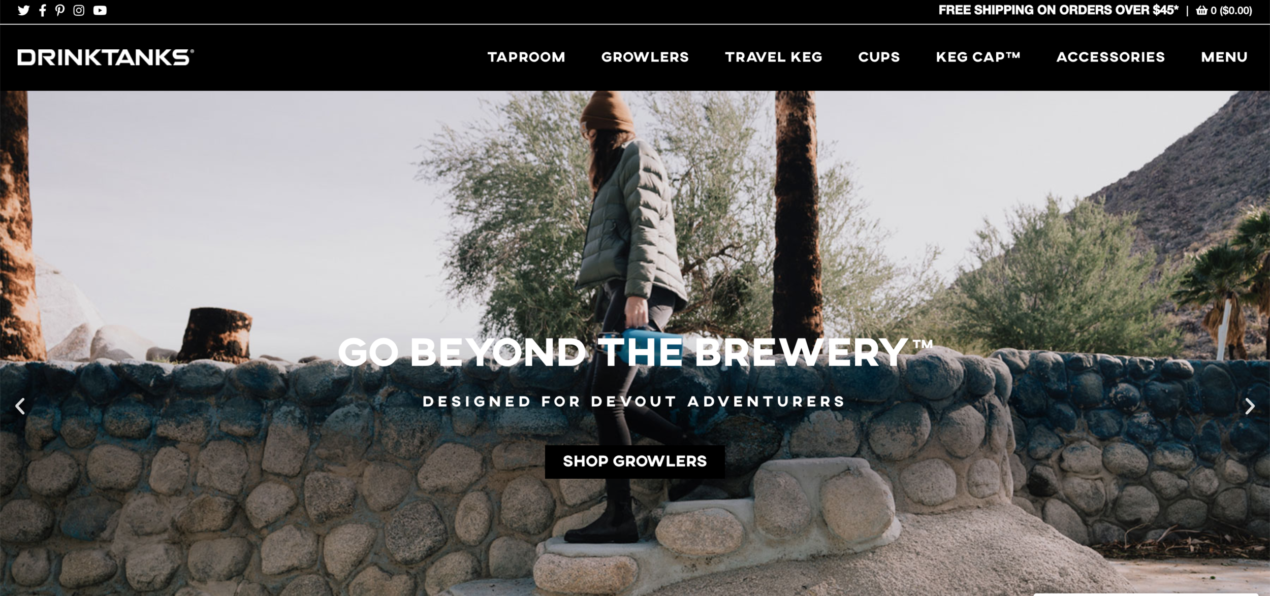
Drinktank website is not bad. It’s clean with high-quality photos and consistent style. But it has 7 items in the navigation bar, including a “menu”??

Drinktank website is not bad. It’s clean with high-quality photos and consistent style. But it has 7 items in the navigation bar, including a “menu”??

The most common thinking is putting everything up there so everyone can see it right away and then convert to the sales. And there are 13 tabs at the navigation. No, you’re overwhelming us only. A bad navigation is like frustrating costumers in the grocery store - you can never find the stuff you need.

2020_portfolio-53.jpg

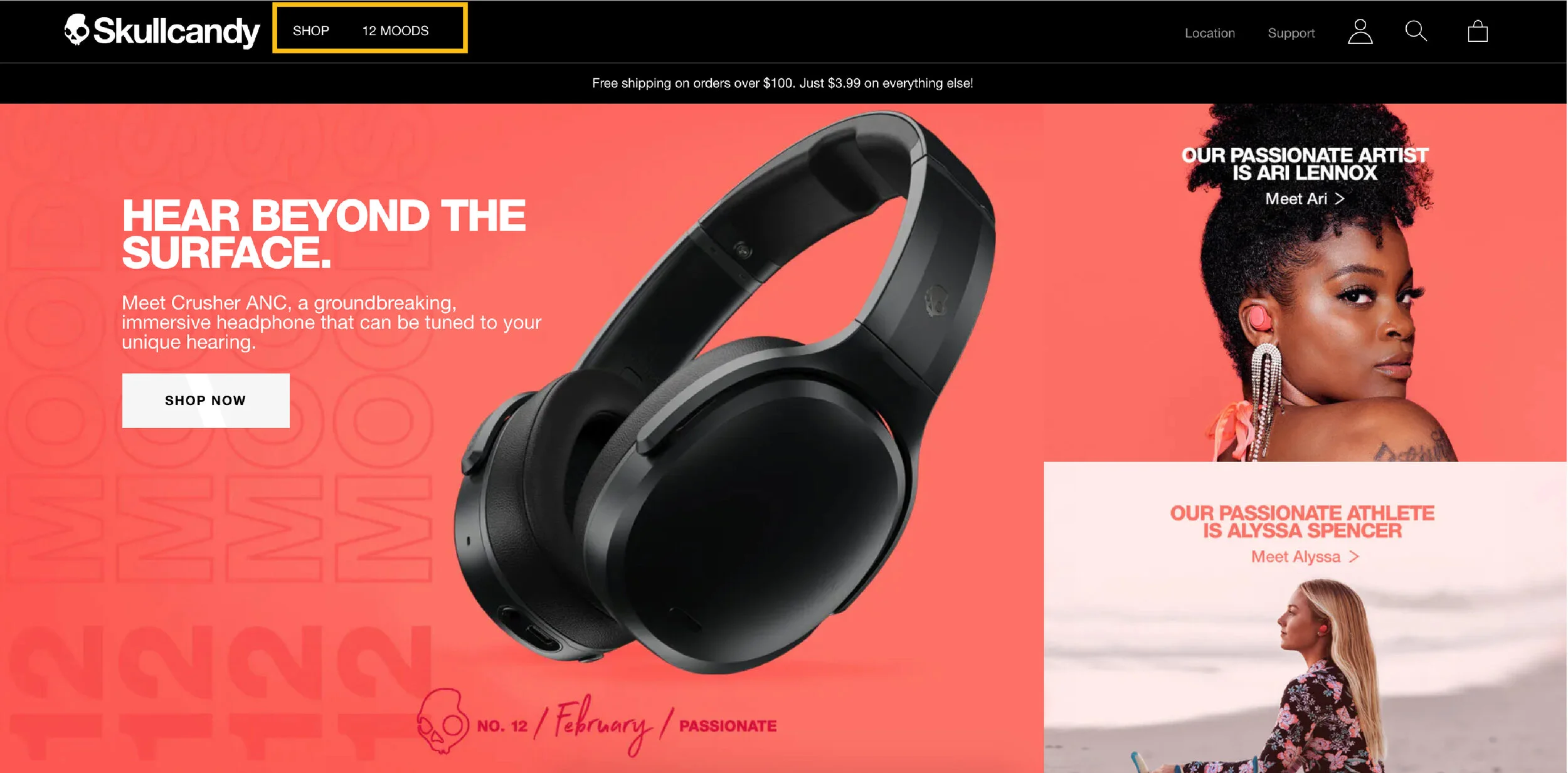
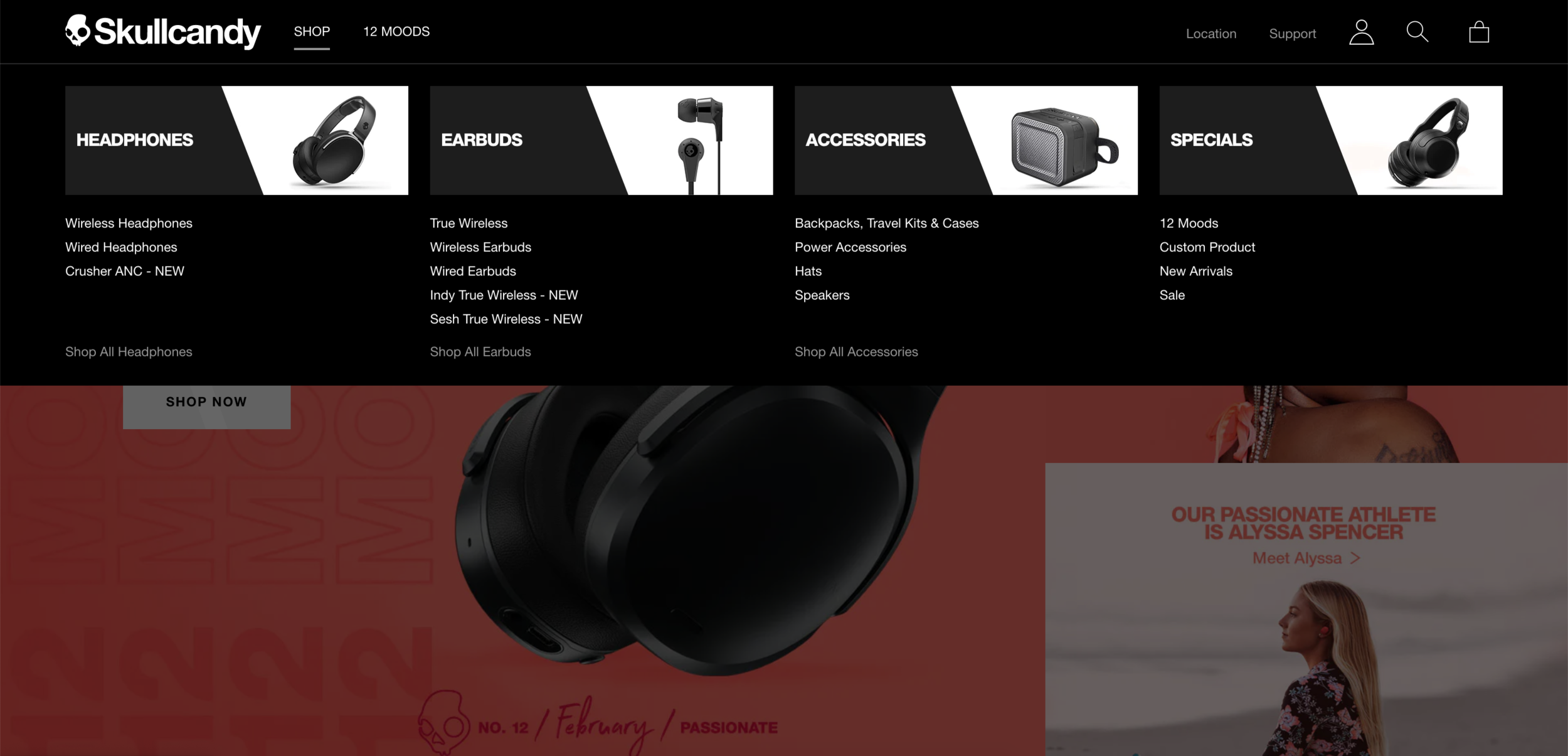
Look at how Skullcandy keep their menu in only two. Here’s how you can find all the products when you click “shop”.

Screen Shot 2020-02-23 at 11.54.06 AM.png

Isn’t that nice? The big header with simple image and consistent style, people can easily understand what types of products they offer.

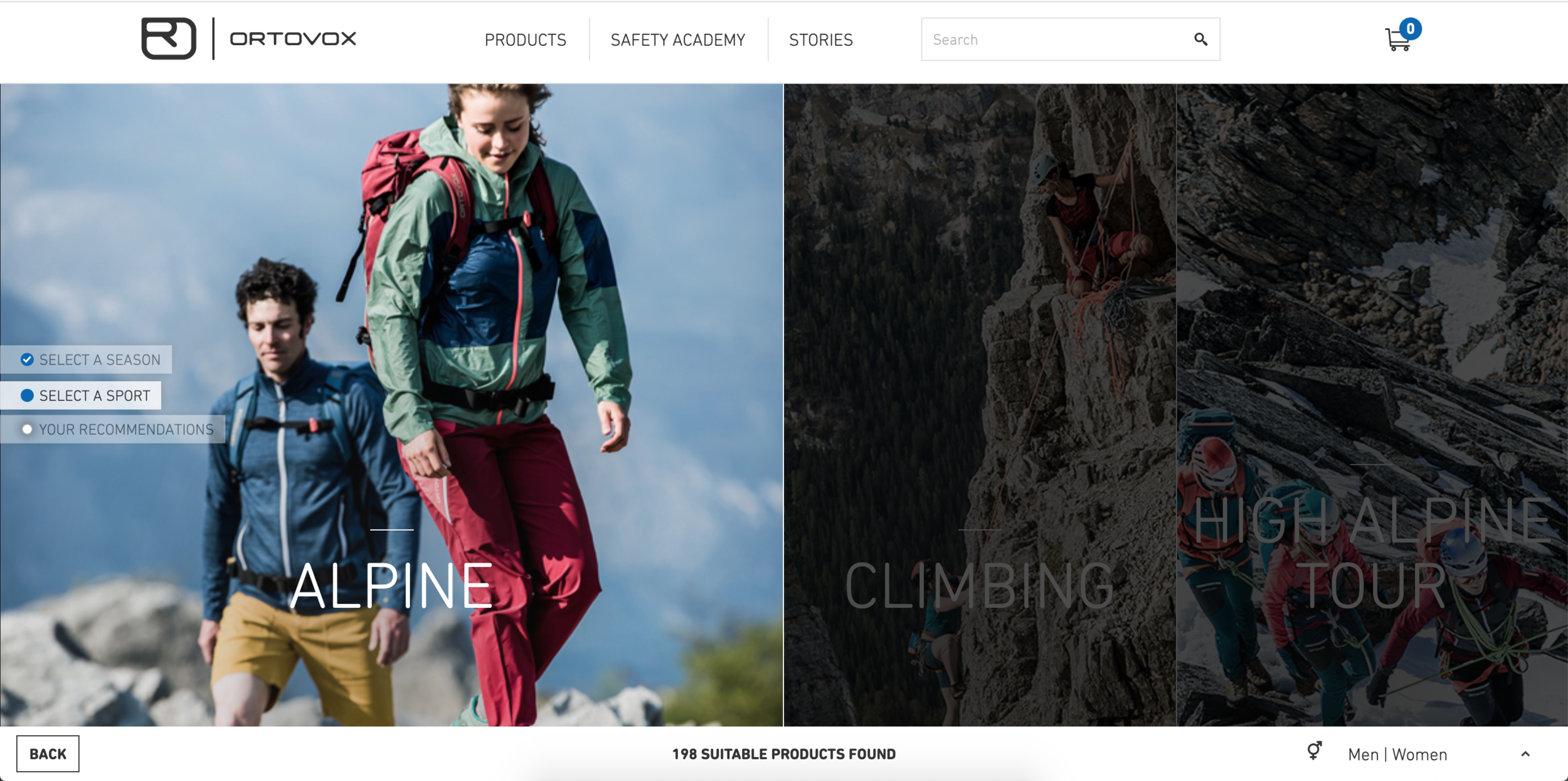
What if you have lots of different product lines? How do you help your customers to know what to buy? A product comparison page or an interactive product advisor page (like this Ortovox page below) will be really nice.

Have some self-control on colors

When people think about making website more “fun” or appealing, they can’t help but asking more colors to it. How you present on website is like how you dress. If you want to look professional, keep it simple and clean. You can choose a strong accent color or interesting pattern to make it pop. Keep in mind that you usually would have photos in your website and that usually includes lots of colors. So keep your text and background super simple and minimal color is really important. Or you might make your website looks like a clown.

So how do you make the web experience more “fun”? Below is a really good example how to present your products playing with brand colors and interactive elements making a “fun” experience.

You need space to breathe

You’re telling a story. You want your audience to be engaged the whole time, and the break between the lines is indispensable for being a good story-teller. So does your website. Here’s an example from Black Diamond website.

BD-53.jpg

Now see The North Face, they do a better job in giving negative space. Even it might be just a bit different but it looks less busy and easier to digest.

2020_portfolio-54.jpg

Please follow the style guide

You should have a style guide specify the logo usage, typography, colors and such. If you don’t have one, please refrain using 1-2 fonts at most. (If you’re using 2 or more fonts in your brand, please make sure they work well together.) Here’s an example of big NONO -

2020_portfolio-56.jpg

I’m guessing they outsourced the website redesign and somehow didn’t pass the brand style guide along. The fonts they use on the graphic are different than the website. It ended up showing at least 4 different fonts on this website.


—-

These brands update their website quite often so you might not see exact the same thing when you visit the site. Also these are like general rules and you have to apply it based on the situations. And there’s always exception. But you better know what you’re doing if you’re breaking the rules.

Comment

How to get shit done and do it really well

Comment

How to get shit done and do it really well

2020_portfolio-52.jpg

As humbleness deep in my Asian gene, I rarely say I’m good at something. But time management is probably the only thing I would say I’m really damn good at. I’ve been so good at this that it has amazed anyone who knows me.


Briefly talked about my history here - why time management is so important to me and how I did it.
When I studied at Art Center College of Design, sleeping deprivation was a norm among design students. People usually didn’t have time to sleep (and then crashed their cars when they drove.) There was just too much work and everyone wanted to deliver the best work. My first term I only had 4 hrs sleep every night at most (sometimes 1 hr). It devastated my health. It was so stressful that I had hyperventilation one day. I decided to use my time strategically. After years of practice and discipline, I’ve been enjoying the benefit it brings.

I can do lots of stuff in a day and still do what I love in my free time.
I can deliver quality work in deadline no problem.
I work really efficiently.
I get shit done. Period.

During the final presentation back in design school. The teacher was giving feedback.

During the final presentation back in design school. The teacher was giving feedback.

The rule of thumb is having a goal, breaking down to small tasks and adjust your time according to your energy and mental state.

1. Focus on what you want to achieve

For me I want quality in work and life. I want to grow my business, have time snowboarding, climbing, hang out with my husband and friends, learn and read, sometimes cook or bake. It’s impossible to do everything everyday. So here comes the prioritization. I break down to small tasks and write them down with priority (almost) every morning.

2. It takes longer than you think

We tend to underestimate how much time everything takes. I timed myself on every task when I was in design school. How much time it took for me to sketch, design this poster, search the solutions for this particular problem, drive to school, talk to my friend, eat dinner, redo this project, etc. It came to the point that it became stressful so I stopped. But for people who always think time slips away, you should try.

3. Set your deadline earlier than it is

Because shit always happens. Just like you aim to get to the meeting 5-10 minutes earlier just in case the traffic is worse than expected. I prefer aiming to finish a project a few days earlier so I have extra time to polish my work. Or I can handle the expectedly troubles. Or I can deal with other urgent work coming in.

4. Understand your work style and schedule around it

Do you work better in the morning or at night? Can you work 8 hrs straight or you need breaks often? Do you work under stress well? What’s the pattern of your mental state? Here’s the example timeline of my day and how I work with my mind.

timeline

Of course sometimes things will change. Like powder day I need to get out in the morning and will need to come back finishing stuff later. Or I somehow feel productive at night and I’ll just follow the momentum working until I want to sleep. The key is utilizing the time differently when you’re more productive and when you’re more creative.


5. Think about the results (positive) not consequences (negative)

If procrastination is deep in your soul, telling you “don’t procrastinate” is like talking to a cat. We procrastinate because it stresses us out, or it’s tedious and boring. If we focus on the negative feelings that associate with the task, it will only push deter us from completing it. Imagine how you feel after you finish that project. Will your life get better? Will you get closer to your goal? Will you be proud to yourself?

6. If you are not working efficiently, don’t work

If you’re extremely tired and doze off when you’re working, just go to sleep. Some people work well with high stress in short deadline and they can pull all-nighters. I don’t do that. I enjoy having enough sleep every night so I can do quality work every day. I even take mini break often so my brain can stay sharp when I’m at my laptop.


7. Prepare for the crux!

My friend Coryna climbing at Indian Creek

My friend Coryna climbing at Indian Creek

Crux is the term from climbing - it means the hardest part of the climb. There can be several cruxes on one climb. You really don’t want to waste your energy before you get to the crux. You want to climb as efficiently as possible. If you already know some parts of the project will take more time or have higher fail rate, give yourself enough time. Also tackle that when you have the most mental energy in a day.


Hope these tips make sense and offer a bit help. Some might be too ambiguous since I don’t want to overwhelm you with details. If you have any question, comment below or reach me. I’m happy to help.


Comment

Which ski resort's logo you like best?

5 Comments

Which ski resort's logo you like best?

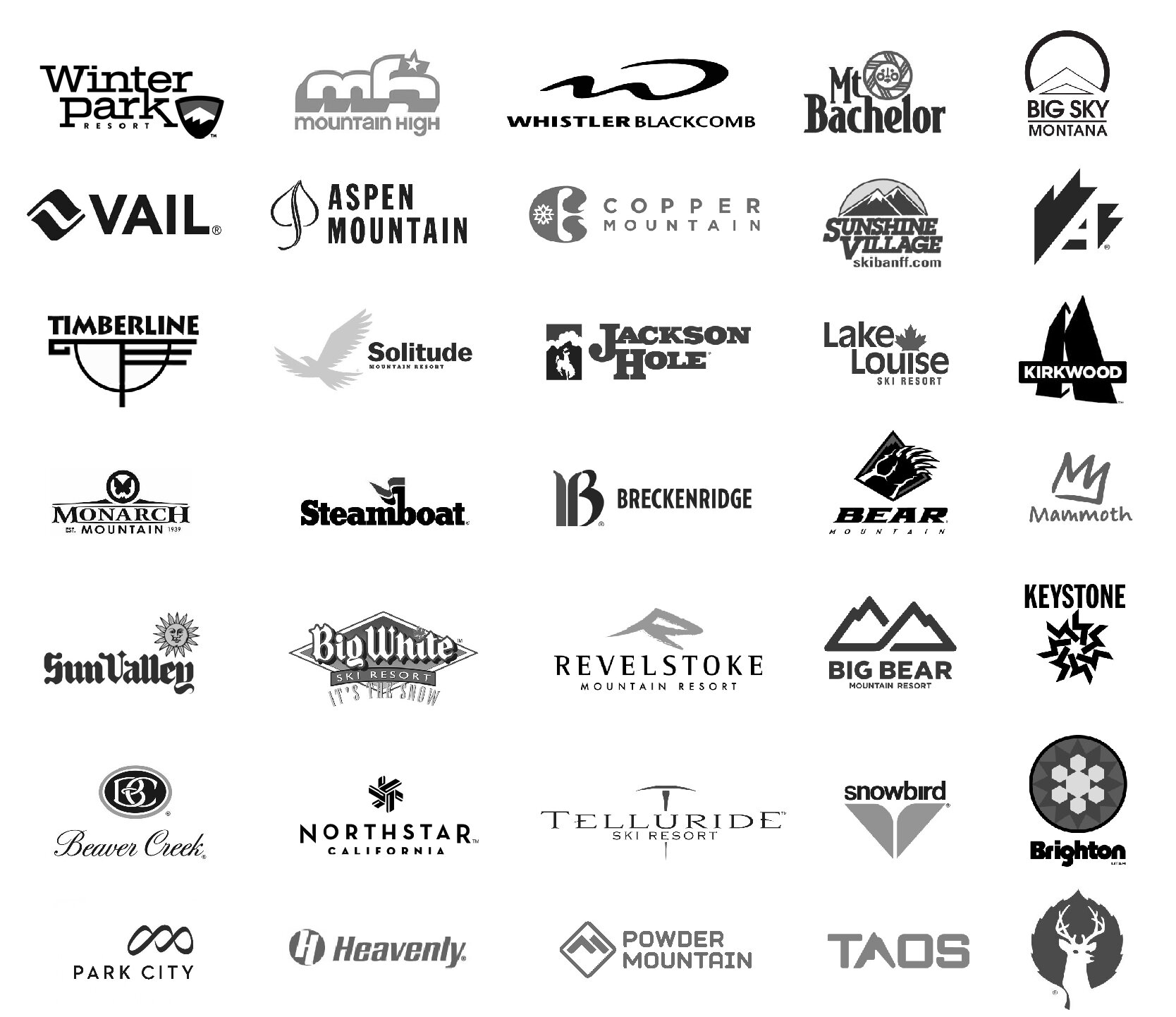
20200207_ski resort logo-01.jpg

Since I fell in love with snowboarding in 2015, I’ve been chasing snow and somehow have been to 33 ski resorts in North America so far. No I don’t have trust fund. I just got a knack of finding the cheap way to travel and also didn’t mind sleeping in my Honda Civic. Here’s the blog of my 2016/17 season.

Canada - 5 resorts

  • Whistler Blackcomb

  • Big White

  • Revelstoke

  • Lake Louise

  • Sunshine Village

US - 29 resorts

  • Big Bear - bear mountain/ snow summit (CA)

  • Mount High (CA)

  • Mammoth (CA)

  • Kirkwood (CA)

  • Northstar (CA)

  • Heavenly (CA)

  • Keystone (CO)

  • A basin (CO)

  • Winter Park/ Mary Jane (CO)

  • Copper (CO)

  • Telluride (CO)

  • Aspen/Highland/ Snowmass (CO)

  • Breckenridge (CO)

  • Vail (CO)

  • Beaver Creek (CO)

  • Monarch (CO)

  • Steamboat (CO)

  • Jackson Hole (Wyoming)

  • Sun Valley (Idaho)

  • Powder mountain (Utah)

  • Snowbird (Utah)

  • Park city (Utah)

  • Solitude (Utah)

  • Brighton (Utah)

  • Deer Valley (Utah)

  • Big Sky (Montana)

  • Taos (New Mexico)

  • Mt. Bachelor (Oregon)

  • Mt. Hood Timberline (Oregon)

I mostly ride solo and I don’t do tricks so there’s no cool shredding photos of me. But here’s a beautiful photo of snow ghosts at Mt. Bachelor - my current home mountain.

I mostly ride solo and I don’t do tricks so there’s no cool shredding photos of me. But here’s a beautiful photo of snow ghosts at Mt. Bachelor - my current home mountain.

As a designer, I can’t help but judging the logos every time. Let’s just see the form first (so I turned them into black and white.) They’re listed in random order.

20200207_ski resort logo-02.jpg

Before you scroll down seeing my comments, take a closer look and see which one you like best and which one you like least.

Let’s get started!

A pretty common themes most resorts have are “mountain” or “snowflake” (duh of course.)

11 out of 33 play with mountain forms

11 out of 33 play with mountain forms

Some of them do a good job making it beautiful or abstract. You usually don’t want your logo too literal. Let’s look at Whistler Blackcomb.

20200207_ski resort logo-05.jpg

Look at that swoop - it’s like W but also like the silhouette of the mountain. I like they use bold and medium font style to differentiate Whistler and Blackcomb. I’m just not sure how I feel about linking L and A.
Another good example of playing with the mountain and the letter form is Revelstoke ski resort.

20200207_ski resort logo-06.jpg

So beautiful.
But I’m not so sure about how they cut the serif on the logo type… The choice of Serif and Futura combination gives the “expensive” vibe. Lots of fine dining in mountain towns have the similar way of presenting logos.

Other good ones I think are Park City and Mammoth. Powder Mountain’s logo reminds me Utah avalanche symbol…

20200207_ski resort logo-07.jpg

Now let’s take a look of the snowflake series.

20200207_ski resort logo-04.jpg

They are not bad. I’m not in love with Brighton’s color. It’s worth noting that Keystone’s snowflake is a 7-repeated-circular-pattern and it forms a star in the middle.

20200207_ski resort logo-08.jpg

The form looks simple but also intricate at the same time. I’m curious who came out with this pattern. Logotype goes with the symbol pretty well too. Strong stem gives a confident tone.

Keystone is where I met my husband so I might be biased. He used to work at Breckenridge ski resort too so I see this logo all the time (stickers, t-shirt, etc.) I’ve been wondering why the B is so fat.

20200207_ski resort logo-09.jpg

Then realized it’s the modernization of the old logo which was supposed to be like calligraphy. I understand why they use sans-serif for the new logotype and hence transform the B. But it looks terrible. The stem is so thick. Not sure what’s the intention of the color but it’s looks like an old law firm.


Mammoth did a pretty good job on their logo redesign though.

20200207_ski resort logo-10.jpg

Not sure if I would put Mammoth sticker on my board if they still used the old one… I like the new one is a representation of M, mountain and it also looks like a crown. It’s simple and also fun.


One of my favorite ski resort logos is snowbird

20200207_ski resort logo-13.jpg

I like it uses lowercase so it feels like a light bird. The minimal graphic of a bird is brilliant. Color choice feels natural and young. Or maybe I just had too much fun every time I went to snowbird so this logo has registered to the happy place in my brain.

Now’s I’m going to nominate the ones that probably didn’t bother to hire a designer.

20200207_ski resort logo-11.jpg

What’s going on here? Not quite sure how a ski resort in Idaho and the other one in British Columbia in Canada would use the same terrible logotype… That sun face………….

20200207_ski resort logo-12.jpg

Sunshine village: That looks like $50 logo
Beaver Creek: It feels like I just walked into a rich grandpa’s place with some decorative antique furniture
Mountain High: Not sure if a high school student designed this
Mt. Bachelor: Your sun face is cuter than Sun Valley but still… it’s time to change.

Actually I’m going to redesign those logos and see if you think that makes sense. Also let me know what ski resort logos you like best outside of my lists.

This article doesn’t really deep dive into the logo analysis because it will be super long. I’ll do that when I do the case study.


5 Comments