


Since I fell in love with snowboarding in 2015, I’ve been chasing snow and somehow have been to 33 ski resorts in North America so far. No I don’t have trust fund. I just got a knack of finding the cheap way to travel and also didn’t mind sleeping in my Honda Civic. Here’s the blog of my 2016/17 season.
Canada - 5 resorts
Whistler Blackcomb
Big White
Revelstoke
Lake Louise
Sunshine Village
US - 29 resorts
Big Bear - bear mountain/ snow summit (CA)
Mount High (CA)
Mammoth (CA)
Kirkwood (CA)
Northstar (CA)
Heavenly (CA)
Keystone (CO)
A basin (CO)
Winter Park/ Mary Jane (CO)
Copper (CO)
Telluride (CO)
Aspen/Highland/ Snowmass (CO)
Breckenridge (CO)
Vail (CO)
Beaver Creek (CO)
Monarch (CO)
Steamboat (CO)
Jackson Hole (Wyoming)
Sun Valley (Idaho)
Powder mountain (Utah)
Snowbird (Utah)
Park city (Utah)
Solitude (Utah)
Brighton (Utah)
Deer Valley (Utah)
Big Sky (Montana)
Taos (New Mexico)
Mt. Bachelor (Oregon)
Mt. Hood Timberline (Oregon)

I mostly ride solo and I don’t do tricks so there’s no cool shredding photos of me. But here’s a beautiful photo of snow ghosts at Mt. Bachelor - my current home mountain.
As a designer, I can’t help but judging the logos every time. Let’s just see the form first (so I turned them into black and white.) They’re listed in random order.
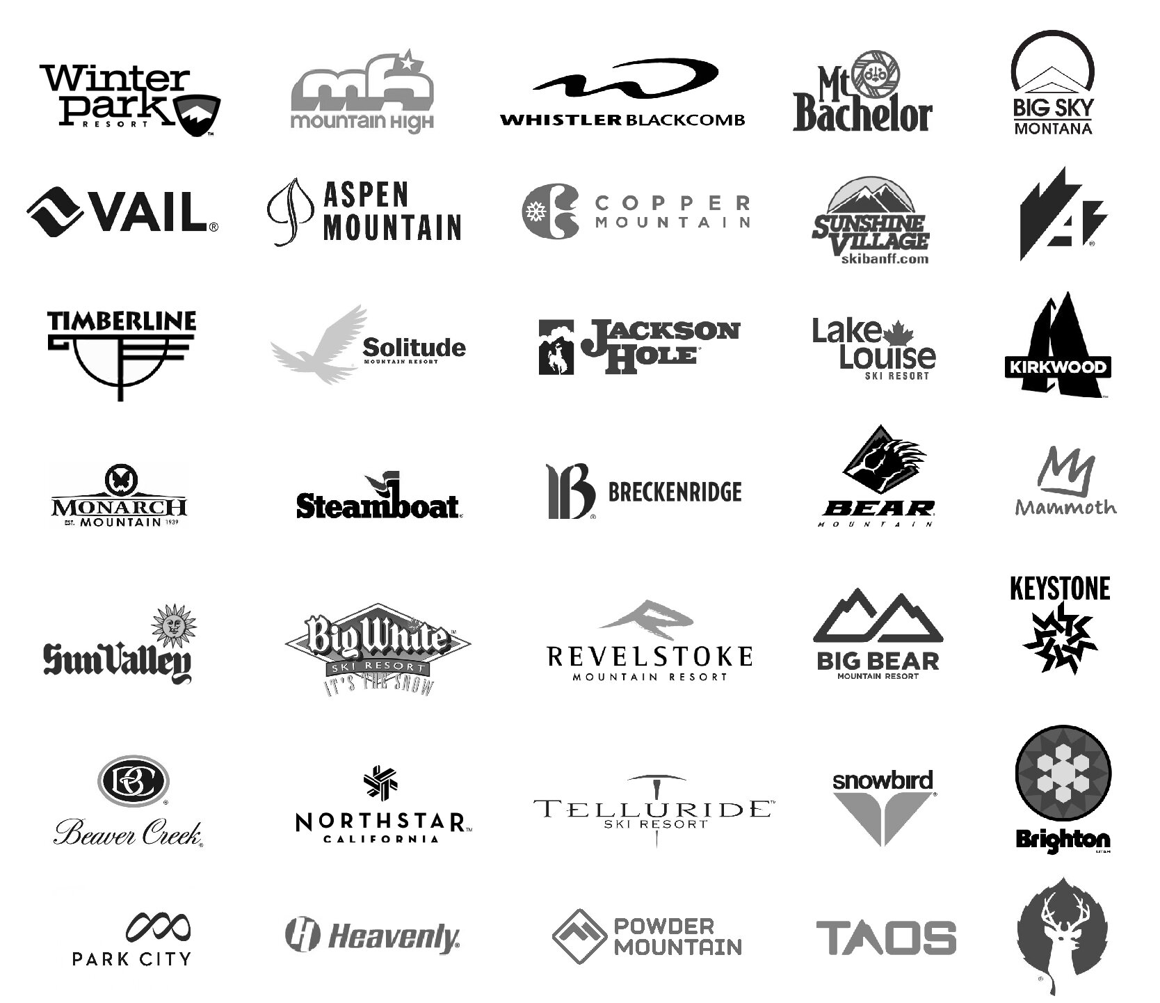
Before you scroll down seeing my comments, take a closer look and see which one you like best and which one you like least.
Let’s get started!
A pretty common themes most resorts have are “mountain” or “snowflake” (duh of course.)
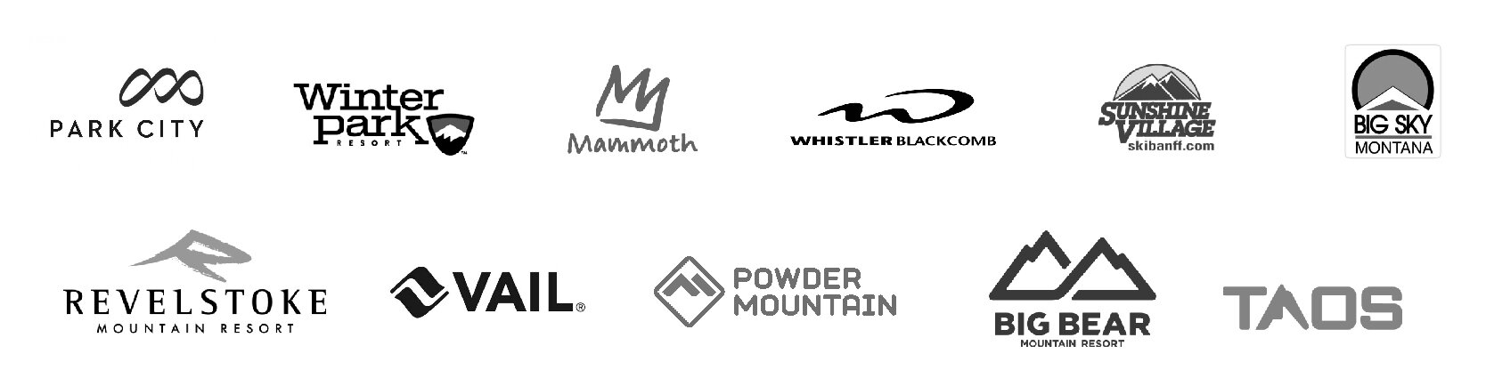
11 out of 33 play with mountain forms
Some of them do a good job making it beautiful or abstract. You usually don’t want your logo too literal. Let’s look at Whistler Blackcomb.

Look at that swoop - it’s like W but also like the silhouette of the mountain. I like they use bold and medium font style to differentiate Whistler and Blackcomb. I’m just not sure how I feel about linking L and A.
Another good example of playing with the mountain and the letter form is Revelstoke ski resort.

So beautiful.
But I’m not so sure about how they cut the serif on the logo type… The choice of Serif and Futura combination gives the “expensive” vibe. Lots of fine dining in mountain towns have the similar way of presenting logos.
Other good ones I think are Park City and Mammoth. Powder Mountain’s logo reminds me Utah avalanche symbol…

Now let’s take a look of the snowflake series.

They are not bad. I’m not in love with Brighton’s color. It’s worth noting that Keystone’s snowflake is a 7-repeated-circular-pattern and it forms a star in the middle.

The form looks simple but also intricate at the same time. I’m curious who came out with this pattern. Logotype goes with the symbol pretty well too. Strong stem gives a confident tone.
Keystone is where I met my husband so I might be biased. He used to work at Breckenridge ski resort too so I see this logo all the time (stickers, t-shirt, etc.) I’ve been wondering why the B is so fat.

Then realized it’s the modernization of the old logo which was supposed to be like calligraphy. I understand why they use sans-serif for the new logotype and hence transform the B. But it looks terrible. The stem is so thick. Not sure what’s the intention of the color but it’s looks like an old law firm.
Mammoth did a pretty good job on their logo redesign though.

Not sure if I would put Mammoth sticker on my board if they still used the old one… I like the new one is a representation of M, mountain and it also looks like a crown. It’s simple and also fun.
One of my favorite ski resort logos is snowbird

I like it uses lowercase so it feels like a light bird. The minimal graphic of a bird is brilliant. Color choice feels natural and young. Or maybe I just had too much fun every time I went to snowbird so this logo has registered to the happy place in my brain.
Now’s I’m going to nominate the ones that probably didn’t bother to hire a designer.

What’s going on here? Not quite sure how a ski resort in Idaho and the other one in British Columbia in Canada would use the same terrible logotype… That sun face………….

Sunshine village: That looks like $50 logo
Beaver Creek: It feels like I just walked into a rich grandpa’s place with some decorative antique furniture
Mountain High: Not sure if a high school student designed this
Mt. Bachelor: Your sun face is cuter than Sun Valley but still… it’s time to change.
Actually I’m going to redesign those logos and see if you think that makes sense. Also let me know what ski resort logos you like best outside of my lists.
This article doesn’t really deep dive into the logo analysis because it will be super long. I’ll do that when I do the case study.