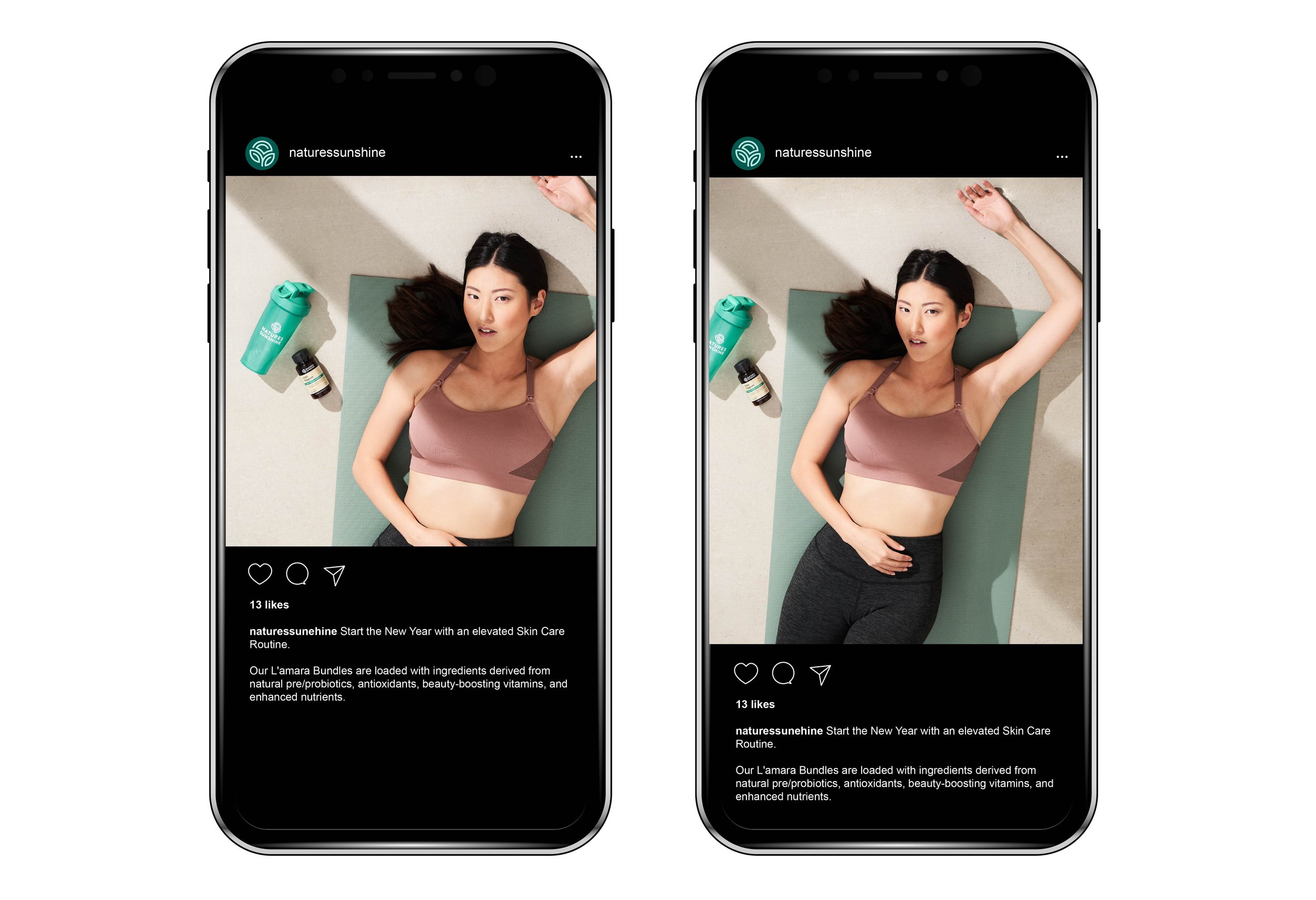
For the longest time, I would crop my photo to square for social posts on Instagram. I’m managing and creating social assets for several companies and we never had a disagreement on square content since the IG grid is square. Until I got yelled at by my friend Topher, who has been a ski content creator and managing several social accounts. He said no more 1:1 image. 4:5 vertical is how you optimize the space in the feed.
This visual mockup will do the justice for 4:5 vertical content
For video, no longer post 16:9 horizontal format on Instagram when most people view it on mobile. You can see the difference in the mockup below.
16:9 video can even tell the difference between horizontal and vertical formats
While they will all be square in your brand content grid, how it’s shown in user’s feed will effect how much attraction it gets.
A small tip makes a big difference.


